Imagining museum marketing shifts based on Gen Z and Millennials' desire Web Design & Branding I 3 Months Curating an interactive exhibition that caters to the needs of Gen Z and Millennials, allowing them to enjoy visiting museums again in the post-COVID era.
Imagining museum marketing shifts based on Gen Z and Millennials' desire, and attract points.
Goal Curating an interactive exhibition that caters to the needs of Gen Z and Millennials, allowing them to enjoy visiting museums again in the post-COVID era.
Overview
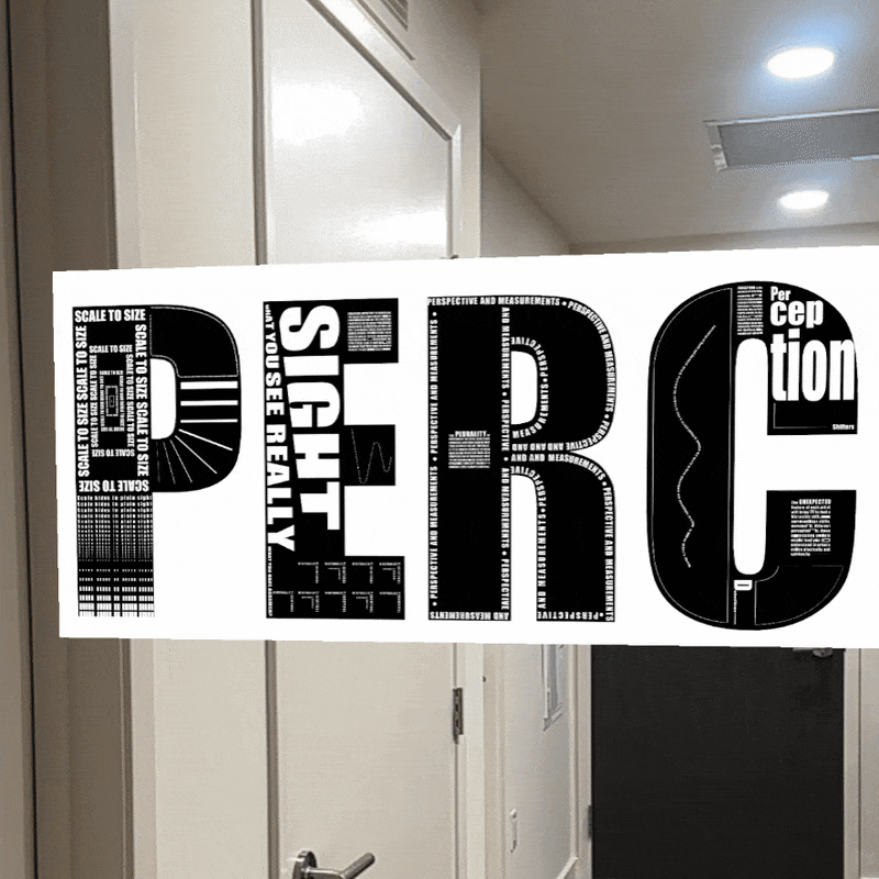
Do you remember your childhood surrounds when every object seem giant? Or a miniature doll house that you used to play with? Perception Shifters is an exhibition showcasing of eight artists. The commonality these artists share is working at distinct scales that present a new perspective to audiences. Viewers experience objects at different sizes than what they’re used to, provoking them into thinking about them differently. The exhibition was curated for the audience who are willing to experience perception shifts that brings different dimension.
Perception Shifters began as a book design, but my work for it has expanded to include flag banners, the exhibition walls, and web prototype with Webflow for the exhibition.
Problem communicating the perception of scale to the audience through graphic design and offering a preview of the exhibition subject through a consistent visual language and system.
User Persona Perception Shifters was curated to take variety of users including families, young individuals (Gen Z), and working classes who are interested in art and interactions (Millennial). This is a example of detailed user profiles that are planned to target on designing exhibition environment, touch points, and identity systems.
Exhibition Book Cover The book was designed with the intent of entertaining audiences who have yet to visit the exhibition due to COVID19 pandemic, providing them an indirect experience of the showcase. An example of its experiential nature is the exhibition book cover’s functional ruler, which allows the audience to take measurements of the visual scale shifts while they carry the book inside the show. I chose a matte silver and black color scheme to convey a futuristic and modern feel.
Exhibition Book Inner Spreads What we see normally might not be it’s true form,The exhibition book explain how perception shifter artists break norm stereotype image and changes our perception to the world.
The inner spread features extreme typographic scale shifts, accompanied by line drawings of artifacts, to demonstrate a simple comparison between the artwork and the average human’s height.
Exteriors For the exhibition, regular banners were designed in white, while memorial banners were designed in black, in honor of one of our featured artists, Otto Piene, who had recently passed away. His wife has been holding memorial exhibitions in his memory, and I wanted to pay homage to our artist by creating a unique black banner. This also gives visitors background and provides context for the experience.
Interier Exhibition walls were design in an idea of the scale of each artist's portrait in relation to the size of their artwork. Reimagining size of human based on each artists' use of scales and real-life object proportions. Through this exhibition, viewers are invited to reconsider their relationship with everyday objects and gain a deeper understanding of how our perception of size can be skewed by illusions and assumptions.
Interactive
Idea sketch It is a current industry trend to incorporate interactive elements into art exhibitions, allowing the audience to immerse themselves in the exhibition's theme. Millennials and Gen Z are attracted to interactive features that allow them to capture photos or videos to share on social media platforms.
Considering that art exhibitions attract a wide range of age groups, I aimed to create an experience that would be enjoyable for everyone and provide an opportunity to capture memorable photographs. As a result, I focused on creating simple yet impactful interactions that would be accessible and engaging for all visitors.
Exhibition Entrance Wall Projection Visitors will have their first interaction with the exhibition at the main entrance through an interactive projection. The projection zooms in and out based on the viewer's location regardless of whether they are standing or walking in front of it. The idea behind this is that different scale shifts provide different viewpoints and information. When zoomed out, the audience can only see the words "Perception Shifters"; however, when zoomed in, they can read about the concept of scale and view supporting illustrations.
AR exploration Currently working on quick user testing via AR Filter. *trouble shooting: imagery blurs as users suppose to see the close-up view of the detail.
Web/App
User Flow Detailed user flow that captures the user experience from the splash page to the point of ticket purchase.
Website The website's main page mirrors the concept of interactive projection. As the cursor hovers over the letters of the exhibition title "Perception Shifters," the letters change their scale dynamically. The dynamic change in scale of the letterforms on the main splash page grabs visitors' attention and effectively communicates the show's core idea. This interactive design can also be engaging for its users and provide a unique online experience.
Web: Home page The home page displays complete images of the artwork and block images of the artists. When the viewer moves the cursor over an image, related objects are highlighted in color, allowing the audience to identify which artist created the artwork quickly. They can access detailed information on the dedicated detail page by clicking on the image.
Web: Sub Pages Website subpages: map of exhibition location, interactive exhibition category, and support page. The map of exhibition location features a 3D map of the exhibition location in New York, providing users with a dynamic sense of scale. Users are also able to check museum events and operating dates by google calendar API. To enhance user experience, we designed an interactive exhibition page that allows visitors to preview the exhibition. The page features minimalistic illustrations of buildings, trees, and human figures, which serve as comparison diagrams. By hovering their mouse over the black boxes, users can see the size of the art works compared to the size of the objects in the diagrams. The next step to the interactive exhibition will be collaborate with engineers and 3D artists to create more immersive space to explore the scale of the art works. They are not done yet, still working in progress.
Mobile Application The mobile version of the website has been optimized for better navigation and viewing on smaller screens, with some changes made to the layout to improve user experience
Conclusion
Creating a consistent brand identity system has always been within my expertise as a graphic designer. However, I have come to realize the need for a greater level of creativity when it comes to exhibition identity and interactive projects.
Next step Expand the contents of subpages on the web/app and collaborate with coders to bring the virtual exhibition to life.